
This is Why Ron Jeremy Will Make You Wary of Misleading Statistics
Pornstar Ron Jeremy walks into a relatively empty barbershop. There are 9 people in the barbershop including Ron. As soon as Ron walks in, the average guy in the barbershop has had sex with over 400 women!
Welcome to the subject of today’s blog post: misleading statistics.
Technically, the above statistic concerning Ron Jeremy is true. Assuming the reports that Ron has slept with 4,000 women are correct, and assuming the other 9 guys have slept with 10 women each. The average ‘could be’ represented as 409.
The problem is this, in this case, it is a misleading statistic. More on this example in a moment.

But First Another Story…
Did you know that the per capita cheese consumption in the U.S. is correlated with the number of people who died by becoming tangled in their bedsheets? Don’t believe me, check this out:
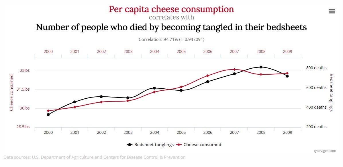
After looking at that graph, you may think ‘shit, I need to stop eating so much cheese or else I may get tangled in my bedsheets and die!’
Before we discuss whether you need to get stressed out about your cheese consumption, let’s examine…
One More Story…
A couple weeks ago you may have read a blog post on Prime Your Pump about a new condiment that has recently come out called Mayochup – it is a combination of ketchup and mayonnaise. Being the risk-averse individual that you are, instead of trying it, you take a quick survey amongst your friends. You put up a survey on Facebook and 5 of your friends respond. All 5 of them say that it sucks.
The question is: Should you immediately swear off Mayochup based on the survey results?
It seems kinda gross to me, so maybe, but statistically speaking you may want to hold off until we discuss misleading statistics in a bit more detail.
What Are Misleading Statistics?
Misleading statistics are precisely what the three previous examples are all about. Statistics are supposed to be used to help us understand things but many times they are represented incorrectly, interpreted incorrectly, and unfortunately, sometimes they are even used to deceive us.
Let’s go back through the previous examples, one by one, to look at how statistics can sometimes be misleading.

First, let’s take the example with our friend Ron Jeremy.
The problem with saying the average guy has slept with over 400 women is that it is a misleading statistic as we are using the wrong type of average in this case.
You see, there are three types of averages: the mean, the median, and the mode.
The average we gave in this example was the mean, which is calculated by adding up all the numbers and dividing by how many numbers are in the list. In this case, we took the number of sexual partners for each guy, added them up and divided by 10. When most people hear average, they think of the mean.
However, there are 2 other types of average:
The median and the mode.
The median is the average you use when you are talking about the ‘guy on the street’, it is calculated by taking the number that is in the middle if you arrange all the numbers from low to high. So, in this example where the numbers are 10, 10, 10, 10, 10, 10, 10, 10, 10, 4000 – the median would be 10. And in this case, it would be the appropriate average to use as it is most representative of how many sexual partners each guys has had.
The mode is simply the number that occurs most often and in this case, it would also be 10.
You can now see why saying ‘the average guy in the barbershop has slept with over 400 women’ is a misleading statistic.
Ok, On to the Second Example
This is the example where the per capita cheese consumption in the U.S. is correlated with the number of people who died by becoming tangled in their bedsheets.
So, can you assume that eating a shitload of cheese means you are going to die by becoming tangled in your bedsheets?
If you have half a brain, you can probably figure out that isn’t the case. This is another misleading statistic in the form of correlation does not always imply causation. Just because something is correlated with something else, does not mean it is the cause of something else.
The cause of being tangled in your bedsheets is likely caused by other factors such as age, health etc.
The lesson here is to be careful not to assume that one thing causes another just because they are correlated (seem to be related to each other).

Lastly, let’s look at the Mayochup Example
The problem with the Mayochup example is that you are making a conclusion based on the opinions of only 5 people; which is likely not enough people to draw a conclusion from. The 5 people you asked do not necessarily represent the opinions of everyone who has tried Mayochup.
The Point of This Blog Post
Is not to overwhelm you with statistics. We are barely scratching the surface here.
The point of this blog post is to make you question the statistics you hear and read, and to take them with a “grain of salt”.
How to Not Get Duped by Misleading Statistics – Use It or Lose It
Again, without getting too much into the weeds here, there are three things you will want to keep in mind the next time you see or hear what you think may be a misleading statistic:
 When someone says average, are they talking about mean, median or mode? Does the average they are quoting make sense in the context they are using it?
Just because A is correlated with B does not mean A caused B. Think about what other factors could have caused B and do not assume A caused B.
Is the sample big enough?
Let’s end this entertaining and actionable blog post with a question for you to consider.
‘Bill Gates walks into a bar: Is the average person in the bar now a millionaire?’
Until next time…beware of misleading statistics, keep eating cheese, and as always…PYMFP!
–Rick
When to Use It:
When you think you may be the victim of a misleading statistic.
What Do You Think?
Can you think of any other examples of misleading statistics? Please share in the comments below!
If you enjoyed this post, it would mean the world to us if you shared it with people you care about via any of the social media platforms below!
Popular Previous Posts:
Why Being a Control Freak is Bad (and What to Do About It)
This is How to Use Visual Management to Be Less of a Hot Mess!
Why You Need to Get Excited About What You Are Doing
How to Overcome Your Fears and Take the Initiative
Why You Need to Stop Wasting Time and Stop Doing Sh*t You Suck At
69 Personal Growth Questions You Need to Ask Yourself
How I Used the Pomodoro Technique to Write This Blog Post
References
https://bothsidesofthetable.com/73-6-of-all-statistics-are-made-up-3c30e8ff272
https://en.wikipedia.org/wiki/Misuse_of_statistics
Rick – great presentation. Don’t let Howie read this next statement, as it might piss him off. A proverb from the old country: “there are 3 types of liars – damned liars, lawyers, and statisticians.”
Statistics can be manipulated to prove just about anything, especially in advertising and politics. That’s where you hear such idiotic statements like “90% of those surveyed prefer Budweiser than previously.” What was the sample size? Who was asked previously? What’s the granularity of the sample size? Did it include men, women, senior citizens, store owners, apartment dwellers, Greek transvestites, Brazilians who own poodles as pets, people who have been strangled by their bed sheets?
Newspapers and TV love to use polls when reporting on politics. “60% of the registered voters polled prefer Finster for Congress, 40% favor Crumpet.” At least here you know that only registered voters participated in the survey. What party do the respondents favor, and were independents included? If ten people were asked, the results are meaningless, if 10,000 were polled, there might be a grain of truth to the statement. If 100,000 people were asked, this is probably a reasonable prediction.
Then there are the charts – line charts, bar charts, pie charts which ‘prove’ and reinforce bogus data to the “average” (is that the mean or the median?) lazy slob. Just a waste of colored ink or colored pixels.
My solution – I’m going to hang out with Ron Jeremy. It will improve my mean tremendously.
LOL! Your statement is safe with me Dave…Too funny! Say hi to Ron for me! Thanks for the wise and funny comments as always.